A workflow builder is a strange thing to design. It's part canvas and part document. People come to it to do something logical and precise, but they arrive with a fuzzy idea in their head and need the tool to help them sharpen it. Get the design wrong and every workflow feels like a fight. Get it right and the tool disappears, and people just think about their work. That disappearing act is the entire goal, and here is how we've been chasing it.
Start from the question the person is actually asking
When someone opens a workflow, they're rarely asking "what does this software do?" They're asking a question about their own process. What happens after the invoice comes in? Why did this run take the wrong branch? Our job is to make the interface answer that question faster than they can finish asking it.
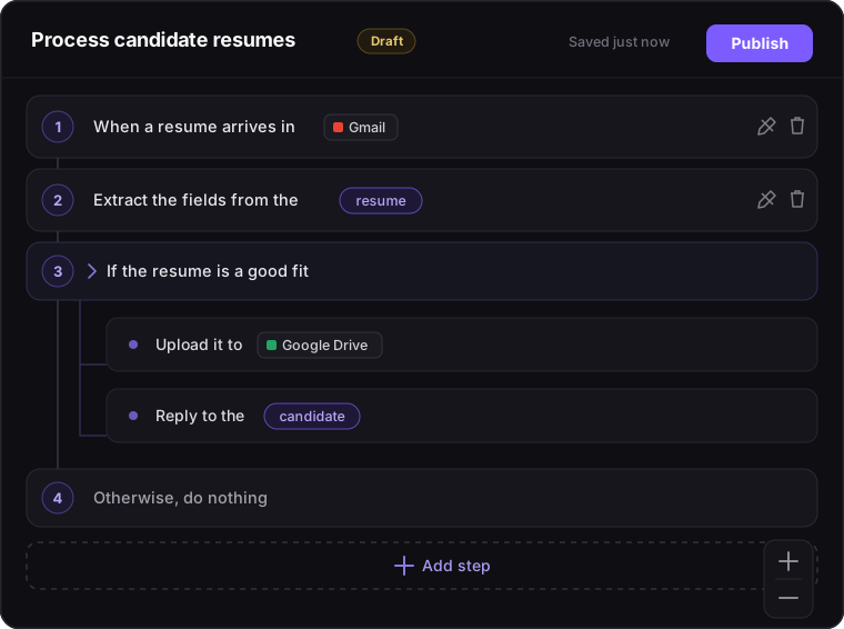
So the first principle is legibility over density. A workflow should be readable at a glance, by the person who built it and by the teammate who opens it for the first time six months later. Every step is written as a sentence, under the logo and name of the app it uses. A date and time shows up as a readable date, like Oct 1, 2026, 3:00 PM, not as a raw timestamp. Values passed from one step to the next stand out inside the sentence, so your eye catches "the vendor's name goes here" without decoding any syntax. Each of those choices is small on its own. Together they're the difference between reading a workflow and deciphering one.
Make the canvas feel like a place, not a diagram
People carry strong, mostly unconscious expectations about how a canvas should behave, and tools like Figma have set them. Zoom should follow your cursor. Panning should feel smooth. The view should fit itself to whatever you're looking at. When a canvas breaks those expectations it feels broken, even when every feature technically works.
So Lodol's canvas behaves the way people already expect. Pinch, or hold ⌘ or Ctrl and scroll, to zoom in on whatever is under your cursor, and scroll or drag to move around. A workflow opens centered, zoomed out just enough to show all of it, and however hard you fling it, part of it always stays on screen, so you never lose it in empty space. Edit and Comment, Undo and Redo, and zoom share one toolbar along the bottom. None of this is novel for novelty's sake. It's all in service of one thing, which is that the canvas should never be the thing you're thinking about.
Structure you can see
Logic has shape, and the design should show it. So a workflow is drawn as a flowchart, the notation most people already know from a whiteboard. It begins at Start and finishes at End. A decision is a diamond that splits into side-by-side columns, Yes and No, which join again below it. A chain of checks, like "over $10,000, else over $1,000, otherwise", is one decision with a column for each case, not a staircase to climb down. A loop's steps sit inside an arrow that circles back to the top. And a loop or decision you're done with can be collapsed to a single line that says how many steps it's hiding.
Rearranging is as direct as the drawing. Drag a step, or Shift-click to pick up several, and a line shows where they'll land. If a move would break the workflow, like putting a step before the one that produces the value it needs, Lodol won't make it, and says which value would be missing.
See what really happened
A diagram shows what could happen. When something goes wrong, people need to see what did. So every run has a page that lists exactly the steps that ran, in order: the branch each decision took, every pass through a loop, how long each step took, and what it was given and what it handed back. Testing in the editor works the same way. Run opens a test run alongside the canvas, the menu on any step runs up to it, from it, or just that one step, and clicking a step in the test run takes you to it on the canvas. Structure you can see is structure you can trust.
Sweat the moment of adding a step
There's one interaction a workflow builder lives or dies by, and it's adding a step. It happens more than anything else, and it's the moment a fuzzy intention has to become a concrete choice, so we've spent more design time here than anywhere else in the product.
The step picker is organized into sections, like Lists, Text, Dates & Times and the apps Lodol connects to, with a search box above them, so you're choosing from a map rather than a wall. Once you've used a few steps, Recently Used keeps your last ten close at hand. Many fields come with example values you can click to fill in, and a short explanation right under the label, so you can tell what a field wants without leaving to read the docs. Type @ to use a value from an earlier step. While you fill it in, a faint preview shows where the new step will land on the canvas. And going back to the list keeps your place, because losing it is a tiny betrayal that adds up over a long build. Small frictions here get multiplied by every step in every workflow, which is exactly why they earn the attention.
Design for the second look, and for long days
Automation is something you return to. You build a workflow once and then read it dozens of times while debugging, reviewing, or handing it off, so we design as much for the second look as the first. The Runs page gives every run a colored status, and a run's own page keeps its status and controls in a header that stays put while you scroll. Teammates in the same workflow show up as avatars, and Comment mode, one press of C away, lets you leave a question right beside the step it's about.
And because people sit in this tool for hours, we treated dark mode as a first-class surface rather than an inverted afterthought. Lodol follows your system's light or dark setting unless you choose one, app logos stay legible against dark backgrounds, and both themes are tested against accessibility contrast standards. For anyone who wants more, there's a high-contrast mode and a dyslexia-friendly font. You can even pick one of eleven accent colors, so the place you spend your day looks a little like yours.
The idea underneath
If there's a single thread under all of this, it's that clarity is a feature, and it's never finished. Automation is about precision and logic, and the design's job is to make precision feel approachable instead of intimidating. Every polish pass, every relabeled field, every smoother pan serves the same outcome: the person in front of the canvas stops thinking about the canvas and starts thinking about the work. When that happens we've done our job, and then we go find the next place the tool is still in the way.
Want to feel the difference a well-designed canvas makes?
Start free, add a ready-made workflow from the library, and notice how quickly you stop noticing the tool.